There are many things that attract a person to watch a film. It can be the synopsis, the cast, the director or simply, just the poster. In the case of Antoinette Jadaone’s Fan Girl, her film’s posters possess a quality that extends beyond selling audiences on the writer-director’s latest film — they’re able to tell a story as much as the film itself.
The latest coming-of-age work from the celebrated Filipino filmmaker swept the awards at the Metro Manila Film Festival and captured the hearts of many, myself included. While the story is centered in the Philippines, tackling fan culture and celebrity life, much of the movie’s message and themes are universal. It’s a movie that’s about six to seven years in the making and the different versions of the film’s poster also took on a life of its own.
We caught up with artist and designer, Karl Castro, the creator behind the film’s striking posters to take us through the evolution of his own way of storytelling through a single image.
I guess, let’s start first with how you got the chance to design the poster for Fan Girl?
Antoinette Jadaone is my schoolmate at the University of the Philippines Film Institute. We’ve collaborated on many projects before. She regularly consults me regarding her scripts, and I’ve been fortunate enough to create the posters for some of her films.
Fan Girl is quite special to me because it is co-produced by Antoinette’s Project 8 Projects, and Epicmedia, which is led by my batchmate Bianca Balbuena. This project was very interesting and took years of development. Before the poster design, I was a script consultant and I’d witnessed its evolution from wry reflexive commentary on Philippine showbiz and the cult of celebrity to its eventual expansion into the feminist vehicle and political critique.
One of Karl’s early favourite designs for Fan Girl: the sticker poster. | Image supplied.
Can you walk us through the process of designing a poster?
When designing a poster, first, of course, I have to be familiar with the film. I always ask to read the script, and if possible, the latest available cut of the film. I guess this stems from my experience as a book designer. When I design books, I try to read the text as much as possible. A synopsis will only give you the main elements, but it is in reading the text yourself that you’re able to understand the mood, the subtext, the literary approach and peripheral imagery, the nuances and small moments which may be less obvious but actually more important in informing the design.
After all, for most good book covers, they don’t show the obvious, partly because one shouldn’t give away too much on a cover. It’s only a teaser, a gateway, a shop window to the material. The same goes for a film poster.
For Fan Girl, since I’m a friend and script consultant, I was very familiar with the film. My first impulse was to look at the print design of fan materials. Growing up, I was exposed to all these showbiz glossies, celebrity notebooks, and so on. There were so many ephemera devoted to fandom, and even if the story takes place in the contemporary digital age, I still feel that the logic of these materials was a most promising form to work with.
I also chose pink because I know there was a coming-of-age story at the heart of the film and I wanted a colour that could encompass both the juvenile obsessions of a young girl and the power of a strong young woman. Plus, of course, it’s an advancing colour and if used well, would be very eye-catching and memorable.
Another motif was the sticker, which is more current. This comes from my observation that the sticker (both digital and physical) is a very contemporary vehicle for fandom. You see them in messaging apps, as GIF reactions, or as superimposed images in TikTok videos. This was actually my early favourite and I still love it a lot. I feel like the repetition of Paulo Avelino’s face walks a tightrope between something a fan would actually do, but at the same time speak ominously about the dark side of the idol’s dominance.
First study (left) and the final version (right). | Images supplied.
Of course, things didn’t end there, and even if she immediately appreciated the studies, Antoinette still prodded me to push in other directions. I had to think of many other alternative ideas to truly test if they were, indeed, the best ones. Perhaps it was also a way to test my mettle as the creator. Antoinette is very collaborative, so she also gathers feedback from the team and some trusted friends so she’s very involved in the development of the design.
This is also why she is able to push until final approval—as you may imagine, major marketing material like a film poster has to go through many hurdles and designers like me are usually not in a position to assert. We need someone to champion the work and I am grateful for directors like Antoinette who do just that.
What setbacks or challenges did you experience during the design process?
One big challenge was working with limited images. We did not have a poster shoot, so I had to work with stills and screengrabs, as well as existing promotional portraits of Paulo. Normally, this is not such a big problem, but in the case of this film, the stills either gave too much away or did not quite capture the overall mood.
Another was, of course, the many studies and revisions. Antoinette and Bianca can attest that this film went through a lot of changes until the very last minute. But that is par for the course, I suppose. Nothing good comes easy although the difficulty is not an assurance of greatness either.
There are a couple of other versions of the poster before the final one got picked, could you tell us more about them and what you wanted to show?
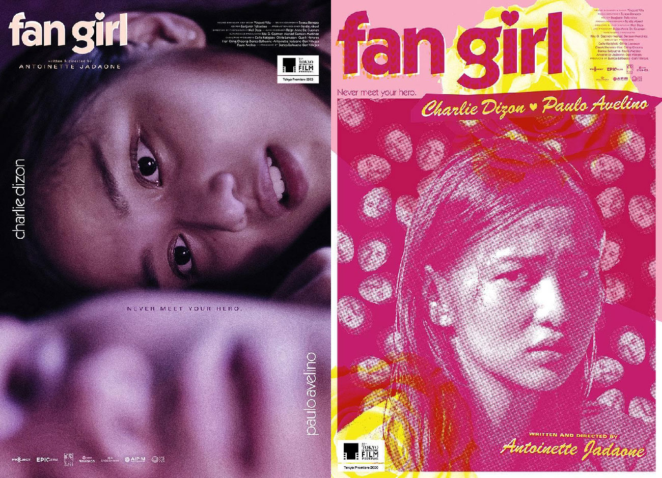
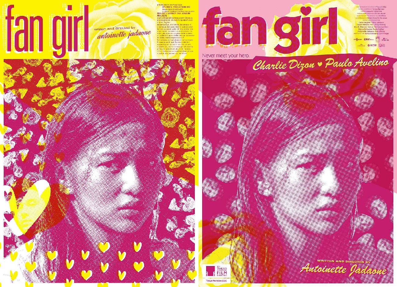
The two contenders at Tokyo International Film Festival. | Images supplied.
One interesting story is the decision regarding which poster to use for Fan Girl’s world premiere at the 33rd Tokyo International Film Festival last year. The choice was between the pink fanzine poster and a closeup of the two from an intimate scene. The more votes came in, the more neck-and-neck it became. I myself voted for the purple one, as I felt it was more daring. It was a sensitive scene, it wasn’t the most flattering image for a handsome matinee idol, and the composition had all the usual elements downscaled in favour of Charlie Dizon’s haunting gaze; as a designer, I always want to push the envelope as much as I can.
Antoinette cast the decisive vote in favour of the pink one, on the basis that its colour and treatment was more likely to stand out amid the predominantly photographic posters in the festival. I agreed, and I also believed this palette would be more easily translatable to other collaterals, giving the film’s visual identity a more distinct look.
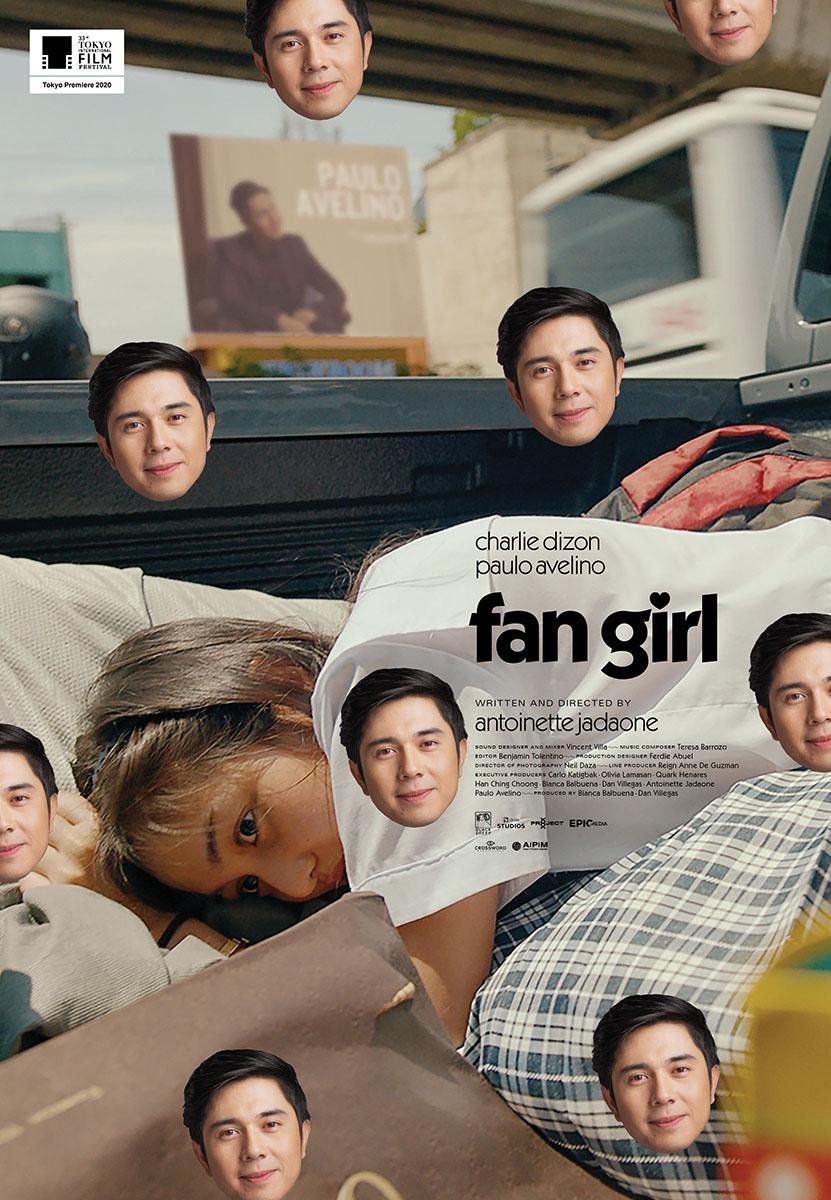
Eventually, when the film got into the Metro Manila Film Festival, the team decided that a more mainstream type of poster was needed, something that showed Charlie and Paulo on more equal footing as a couple. At that point, I was preoccupied with other projects, and also honestly not that interested in crafting a solution to that challenge. New official festival posters were created by the marketing team hewing close to the pink poster’s visual elements. Eventually, the other unreleased posters were also circulated; among my film projects to date, I’d remember Fan Girl as the one with the most “official” posters that weren’t character or teaser posters.
For the official poster, why do you think this was picked and what aspects of it truly encapsulates the film?
It depends on which you consider the official poster as the film had several throughout its run.
The pink poster, as I earlier described, had a visually arresting palette which was effective in the context of marketing concerns. But beyond that, I think it’s the tensions that play out in the poster that make it very effective. Normally fanzines have cute, smiley pictures of idols on the front; this one has Charlie (a relatively new and unknown face at the time) with a rather pained expression. (Is she wounded? The treatment obscures the certainty). The swirling Paulo faces also create a dizzying effect. So despite the bright colours, there is that unsettling feeling that all is not well.
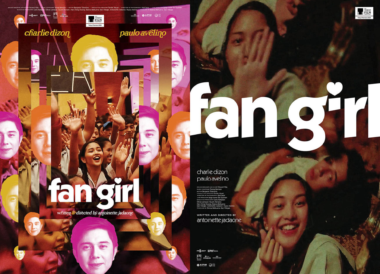
Alternate posters for Fan Girl designed by Karl Castro. | Images via Facebook.
The purple poster is quite jarring in its closeness, it thrusts the viewer at the centre of a very voyeuristic moment. So close to the desired idol, like a moth to the flame. The dominance of skin on the pictorial space, while not literally revealing, is still suggestive, especially in light of the very tweetums title.
Both posters, I believe, capture the reflexive, even perhaps the subversive side of the film. Personally, I think those are its most valuable facets, and I am glad the posters were able to capture that.
To you, what makes a good poster?
A good poster conveys a lot by saying very little. A good poster will capture a feeling without necessarily illustrating it. It should raise questions and spur the viewer to dig deeper. Formally, perhaps it can also drive us to see or interpret things differently. And it will stand the test of time. A good poster remains compelling, long after the film’s novelty has worn off, after aesthetic trends subside, after audience sensibilities evolve. This conceptual elegance, this simultaneous engagement with past, present, and future concerns is what I always aspire towards. Only time will tell, of course, if I attain any success in that regard.
What is the role/importance of posters for films?
Posters are the gateway to the film. It sets expectations. It is an early decision point: if a poster is bad, perhaps half the battle is lost. With a weak poster, it is so much harder to convince someone that a film is worth their time and resources.
Film posters are the mnemonic, the icon, more trailer than a trailer. And even after watching the film, at the back of your mind, you will always refer back to the poster.
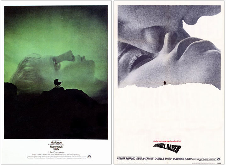
Castro cites the poster for Rosemary’s Baby as one of his all-time favorites| Image via MUBI.
Can you tell us your favourite movie poster and why?
That’s a tough question because there are so many!
Right now, I’ll say Rosemary’s Baby. Designed by Philip Gips and Stephen Frankfurt, it has many of the qualities I admire in a film poster: it doesn’t show a scene in the film, it establishes a mood, it uses typography and text in a very thoughtful way. And of course, its graphic composition is very eloquent even if restrained. This is the same duo behind the poster of Downhill Racer, another poster I greatly admire. Both posters are masterclass in orchestrating elements for visual and emotional communication.
I just have to ask, what’s your favourite part about Fan Girl?
I love that Fan Girl still got its moment even when all the cinemas were shuttered. In pre-pandemic times, a film like this, with its sensitive subject matter and language, would never have made it to the very box -office- and family-oriented Metro Manila Film Festival.
Moreover, I love that it was able to raise questions about idolatry and misogyny in a time when the Philippines is grappling with authoritarianism built largely on those values. I truly appreciate that it is a production that does not just tackle gender empowerment as a topic, but also reflects it in its production ethos; it is written, lensed, directed, and produced by women. Not that women’s issues should be relegated to women alone, mind you, but the more opportunities that we can get to push for equal opportunities and representation, the better.
What should we look forward to from Karl Castro?
Nothing. Joke. It’s a tough time. I think I’m about to enter a new chapter in my creative life. Just recently, it crossed my mind—I want to give up on everything, on book design, on film plans, on the YouTube series I’ve been trying to get off the ground for maybe two years now.